A journaling and habit tracking app built for overthinkers.
Habit Journal is a journaling and habit tracking app I designed and prototyped using Claude and React. Users log what they did in a day and how they felt, and the app looks for correlations so users can see how different activities affect their mood.
This prototype was built using Claude's cheapest $20 Pro subscription, in 2 months, meaning this prototype cost $40 to make. My goal was to minimize token usage and keep costs low while creating a code-based prototype that would streamline developer handoff.
The category of wellness apps is centered around engagement. They often contain streaks, daily use incentives, reminders that pull you back in. Those mechanics work for plenty of people, but for the user I built this for, they backfire, which is where this project comes from.
I designed this for people who are analytical to the point of perfectionism, organized, prone to overthinking. This kind of person may seem contradictory, but that's human nature. They're drawn to self-tracking, yet also not suited for how most self-tracking apps are built.
For this user, streaks and structured rituals either don't motivate or only motivate temporarily. Instead of helping, they add another arena where one can fail.
Analytical, self-critical people are drawn to self-tracking, yet are incompatible with how it is usually built. The engagement mechanics that work for some people are, to them, a source of stress, one more thing one didn't do correctly.
The app shows what habits correlate with certain feelings. It doesn't tell you what to do about it, or imply there is a correct way of doing things you missed.
Nothing in the product manufactures failure for a day you didn't log in to the app. The target user has enough self-motivation to return to the app on their own, and doesn't want to feel punished for having a busy day or an off day.
The target user is analytical and wants to see the details, to understand how the app works. This means the app doesn't hide information or assume a simpler interface is better. In the Insights tab, insight types don't appear and disappear depending on whether or not there is info. The full scale of what the app tracks is always visible.
Streak counters are the industry default and are very effective for some people. However, they aren't a good choice for the app's target user.
For the perfectionist, it manufactures a moment of failure when you break a streak, which, when combined with their perfectionist tendencies, creates a negative experience that affects their overall impression of the app - this user doesn't want to do something if it isn't done perfectly. Making it opt-in doesn't fix it. Testing found that self-reported perfectionists would opt into the streaks thinking it would motivate them, then have it backfire when life inevitably got in the way.
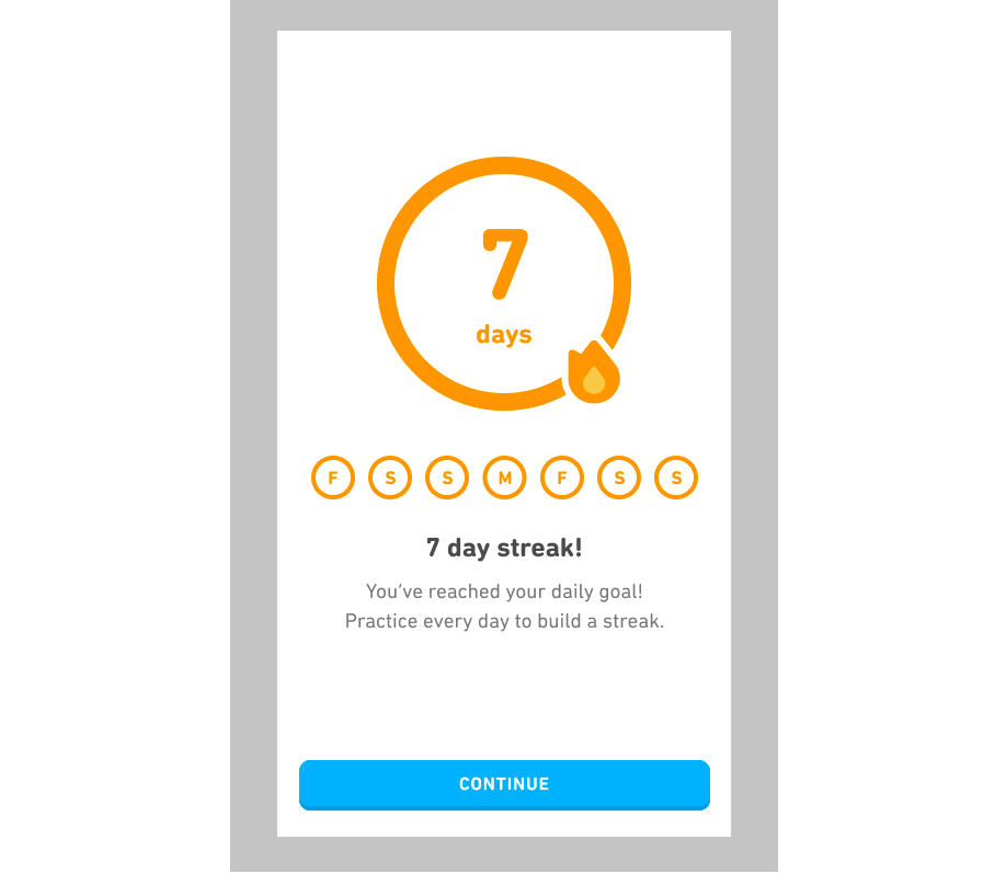
An example of a streak counter
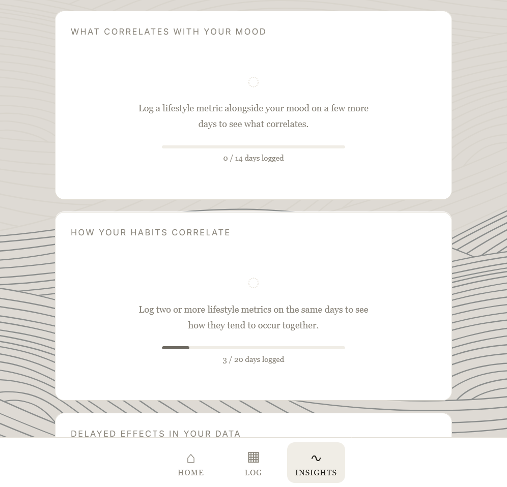
The alternative this app uses, a progress bar
Instead of streak counters, I used a progress bar counting days logged against the number of days needed to show correlations in data. This encourages users to use the app at their own pace without the failure messaging of a potential missed streak. I was inspired by Duolingo's progress bar for cards that didn't yet have enough data to show a metric. Although Duolingo has some design choices that go against this app's design philosophy, this section was aligned with the design principles because it removed the failure conditions and allowed for user choice.
The original design was a two-part daily flow: morning check-in and evening reflection. It was meant to help users notice and record how their mood changed throughout their day depending on what they did.
In practice, users would miss one step and break the flow. If they skipped the morning, the evening had nothing to reflect against. If they skipped the evening, the day's log felt incomplete. Whatever half they completed felt diminished.
Logging twice a day daily isn't realistic for most people, so this wasn't an edge case. For an analytical, self-critical user, any chance for them to say "I did part of it wrong" is exactly what the app should avoid.
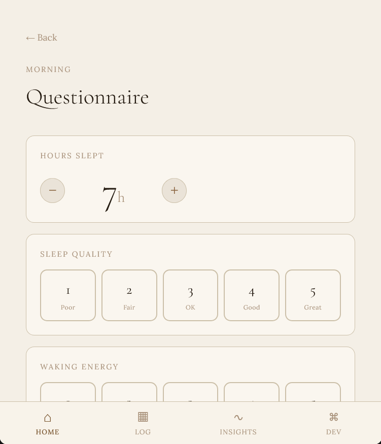
The first part of the original two part flow, where users check in mornings and evenings
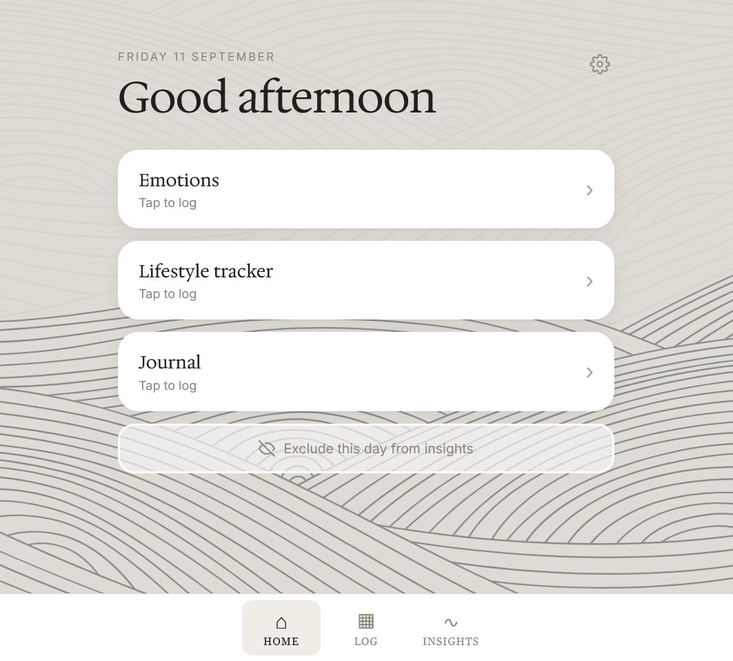
The new flow, which works any time
When doing UI design, it's typically better to keep interfaces simple and hide unnecessary information. In this case, this would mean hiding data insight cards until they have enough data. There are several to scroll through. Removing the unused ones would be cleaner, less cluttered. I chose not to follow this rule of thumb. Every possible insight card is always visible, whether or not there is enough data to populate it.
The reason is the user. Someone analytical isn't bothered by more information, but they are bothered by not knowing how things work. Someone analytical watching cards appear and disappear starts wondering why. Starts trying to reverse-engineer what triggers each one. Starts checking obsessively. A stable UI where every possible insight is visible removes that interaction. Then the user sees what the app can tell them and can tailor their usage to see the insights they're most interested in.
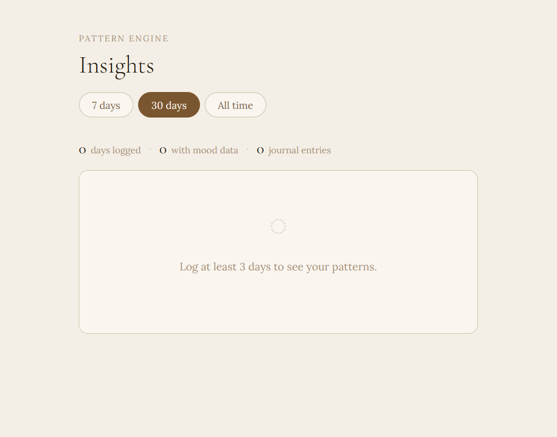
A minimalist design that hides cards lacking data. Leaves users wondering how the app works and what next steps to take.
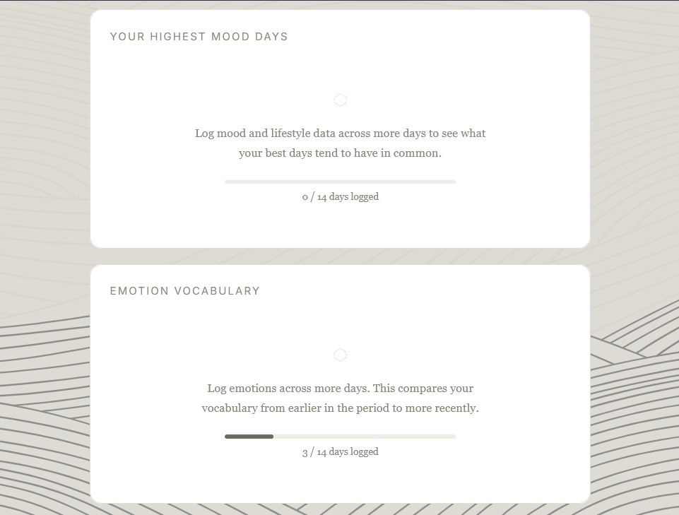
The cards tell users what to do in order to view analytics. Builds trust and lets them plan next steps.
Every decision in this project traces back to the target user, and to one thing about that user: they are analytical to the point of perfectionism, and they need something different from the mechanics that make most wellness apps engaging.
Removed the mechanic that manufactures failure on missed days.
Removed the two part flow that made partial completion feel bad. Whatever you record is now useful on its own.
Decided against the disappearing UI elements that create questions for analytical users. What the app can analyze is always visible.