A travel preparation app designed to reduce the stress of packing and planning so users can have a more enjoyable trip.
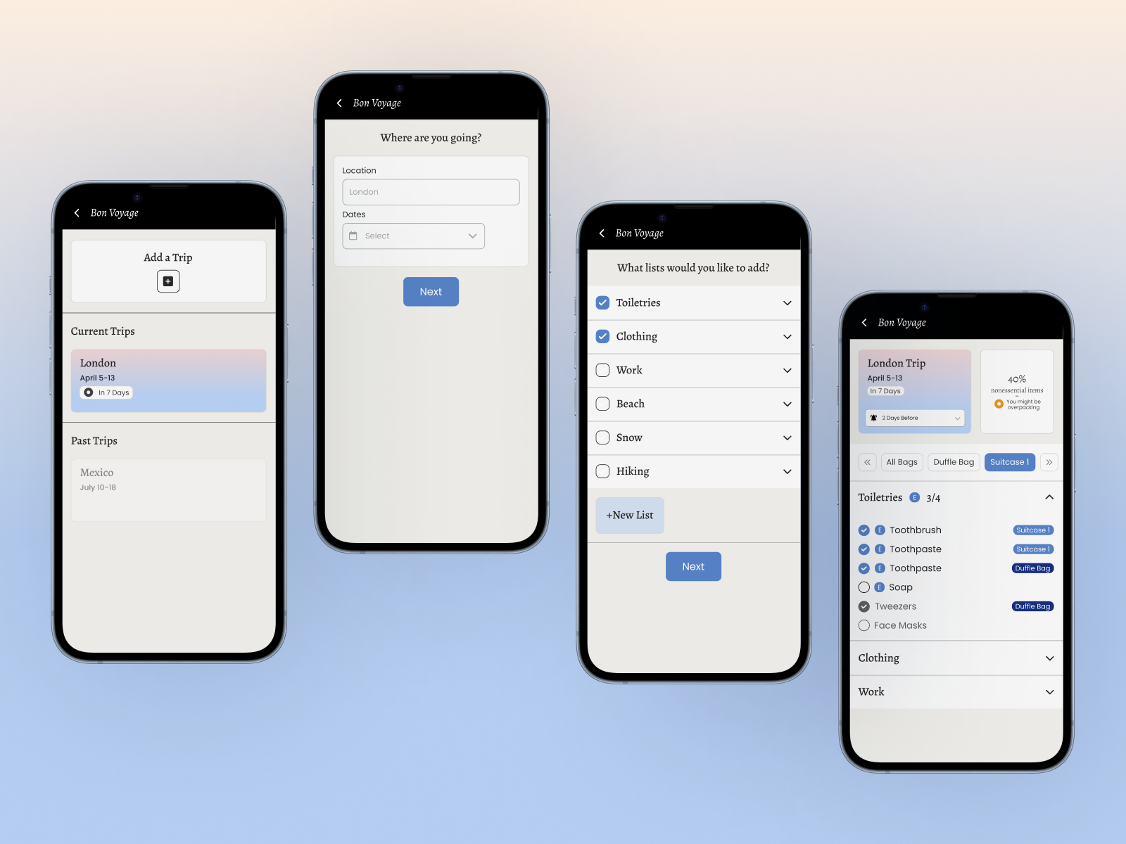
Traveling should be exciting, but sometimes the cognitive load of planning means it can get stressful. Between packing lists, booking tasks, and the fear of forgetting something important, the preparation process takes up time and energy, especially for people who are disorganized, over-planners, or managing a busy life.
Bon Voyage is an app designed to take the stress out of trip preparation for the target user, someone who finds packing stressful because they are disorganized and tends to overpack.
I conducted user research in the form of short interviews and questionnaires to understand the range of travel preparation experiences and identify the core frustrations people carry into a trip.
Users made lists but lost track of them, or procrastinated until the night before and rushed to pack, which led to forgetting things.
People who traveled often would rebuild a new list for every trip. This felt repetitive and took away from the excitement of the trip.
Overpackers had a fear of underpacking. Their main issue wasn't forgetting things. Instead, they kept asking themselves, "What if I need more?"
Before designing, I compared two other packing apps to understand the gaps in what they provided and what they did well.
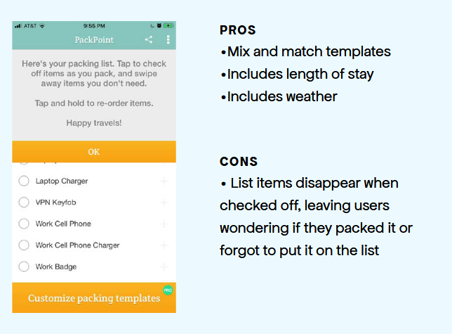
PackPoint offered smart list generation based on trip length and weather. This allowed for easy list creation. However, one pain point was that checked-off items disappeared entirely from view. This made it impossible to see what had already been packed.
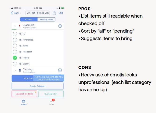
Pack List kept items visible after checking and offered sorting between "all" and "pending". What it did well was allowing users to reuse lists, and allowing them to sort by pending items. It also suggested items to bring which could help a forgetful user. But heavy use of emojis made the interface feel too casual.
I began with paper prototypes across five key screens: the loading screen, trip creation, activity selection, the packing list, and the map view.
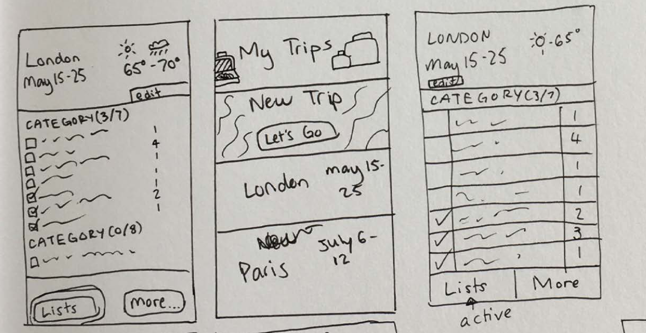
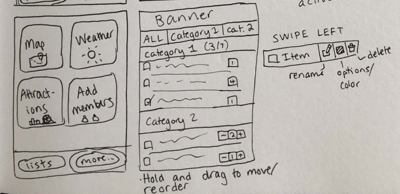
The most important piece of early user feedback was that the the "New Trip" button was taking up too much space, pushing existing trips under the screen. Users wanted to see their current trips first, not the button.
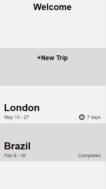
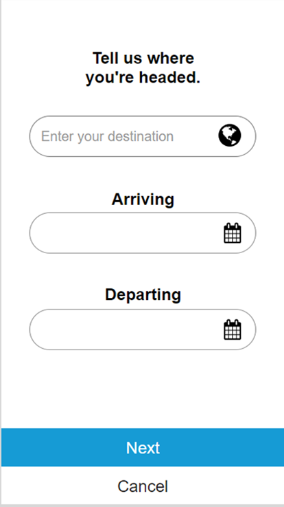
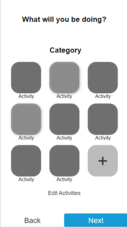
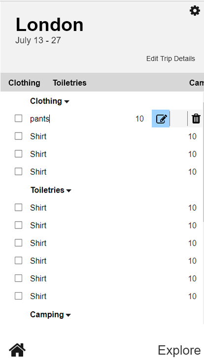
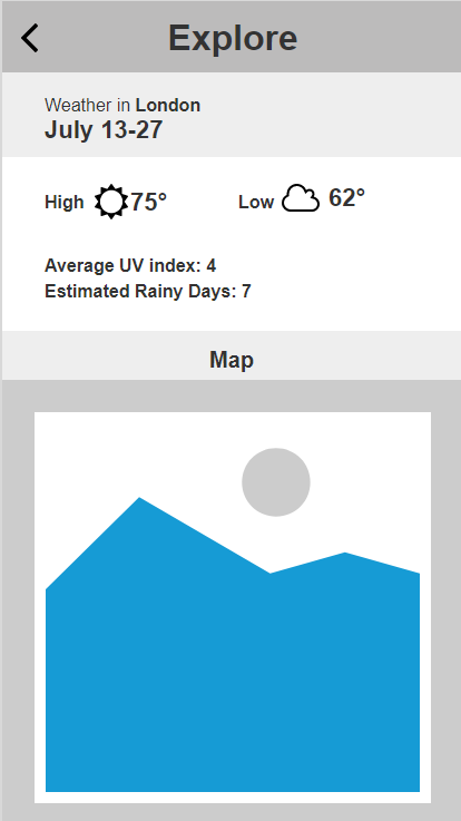
Next I revised the prototypes based on the first round of feedback and created digital prototypes. Testing the new prototypes revealed a new problem. The dark header, dark "Current Trips" bar, and the deep blue location image on the home screen created too little contrast between sections.
For Sasha's overpacker persona, I added the ability to mark essential vs. nice to have items. I added a visual completion indicator only tied to essential items, giving her a signal that she was done packing. Users who didn't care about the distinction had the option to simply ignore the tier and use it as a regular list.
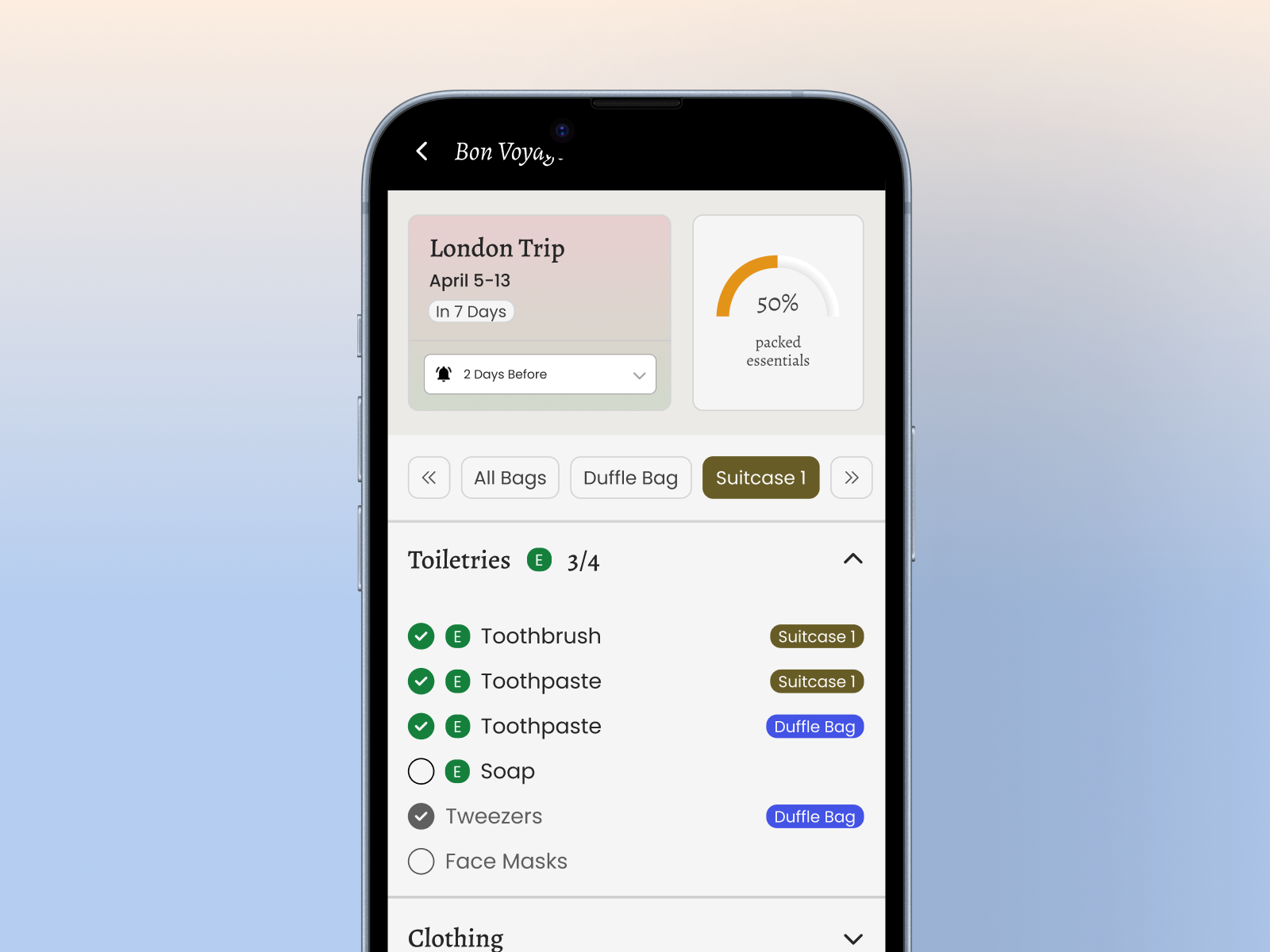
The app generates a packing list from user inputs such as destination, length of stay, weather, and selected activities. It works by combining modules for each selected input. For example, the hot weather list would include things like sunscreen and sunglasses and the international list would include things like passport and adapter. Users can edit the lists if needed rather than building from scratch. This addresses both the frequent traveler's need for reusable starting points and the forgetful packer's tendency to never make a list and forget important items.
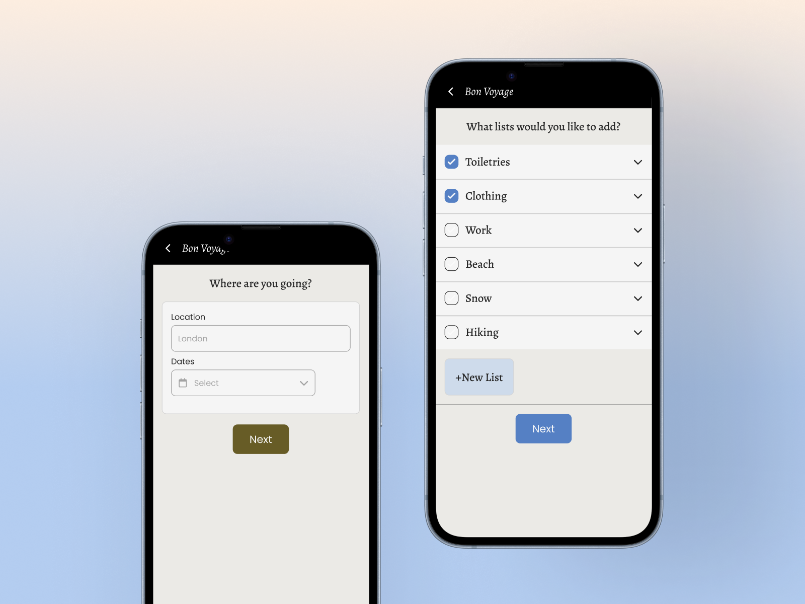
There was a significant difference between the first paper prototype and the final design. It's important to be willing to redesign and not take negative feedback personally as feedback might require you to change things in order to get the best result.
For the target user, packing for a trip isn't emotionally neutral. The color system, copy tone, and interaction pace all need to reflect that the user is in an anticipatory, slightly stressed state, not a calm, task management one. This was a good example of how UX design extends to visual styling, in addition to user flows and information architecture.
Qualitative feedback told me what was frustrating but metrics would have told me
how much. This would provide more concrete measures of how the app performed than
using subjective descriptions of issues.
Some metrics I would test are task completion time,
error rate, and satisfaction scores.